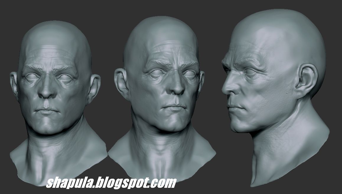
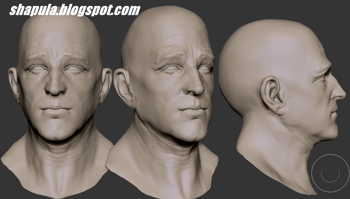
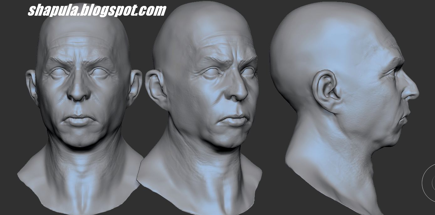
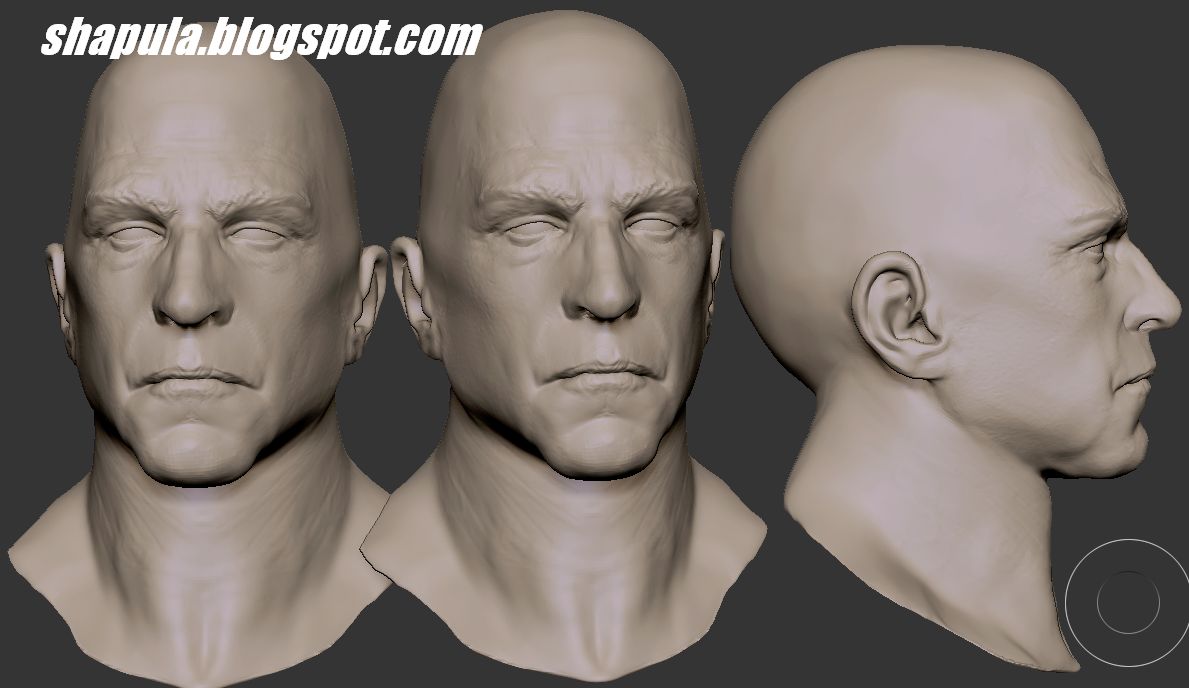
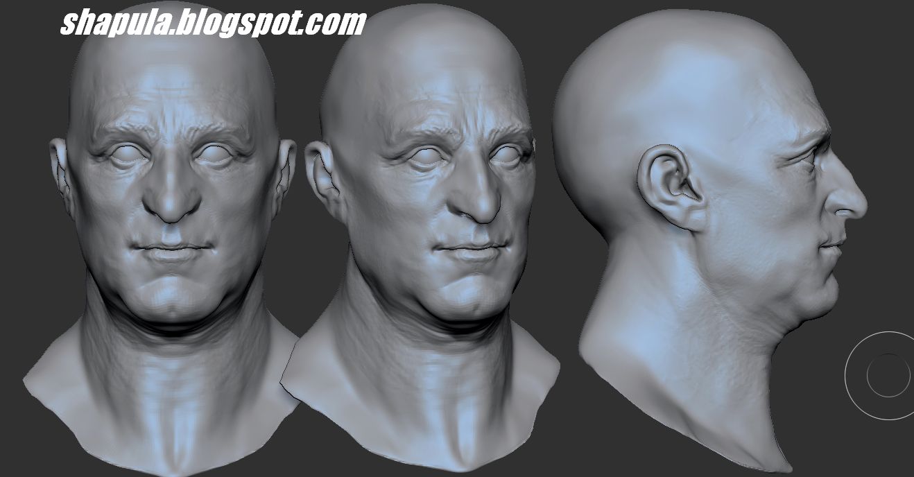
Today I'm posting some clay render shots of some of my previous sculpts in Zbrush.
The main reason behind doing this is to gauge my sculpting progress over time. When I first picked up Zbrush a couple of years back (around this time of year in 2012) I had never sculpted a thing in my life!
Actually thats not true: when I was 14 or 15-years old I made an alien for a school project in some sort of clay. Needless to say it was crap! It had 3 'legs', no arms or eyes, and a long snout with 'teeth' at the end.
But anyways, ignoring that particular sculptural disaster, sculpture just wasn't my thing. So when I tried Zbrush it was a whole new territory for me. And I loved it. Now I wasn't very good at it mind, but it was a lot of fun using the program.
I'm happy to say that I've got better at it and more confident in what I can make with it.
A big help was the endless supply of quality work that inspires me - people such as these talents, amongst many others:
http://pilcrowdesigns.deviantart.com/
http://trevorgrove.deviantart.com/
http://alfredparedes.deviantart.com/
http://marknewman.deviantart.com/
http://boularis.deviantart.com/
http://thiagoprovin.deviantart.com/
http://locasciodesigns.deviantart.com/
http://monsterpappa.deviantart.com/
I've written a little about each of the images below explaining what I've learned from each.
 |
| 1: click to enlarge |
1: The character heads above have something my earlier sculpts didn't - 3-dimensionality! Seriously, my earlier sculpts where designed to be seen purely from one angle alone (meant for 2d paint ups only). In the two shots above I'm pleased to say that they could be viewed 'in the round' and not look like s**t.
I paid special attention to the eye area - something I always try to get right. if you lose the eyes, you've lost the character.
If I was making these again I would work more on facial creasing by using the Dam Standard brush which is perfect for that kind of stuff.
 |
| 2: click to enlarge |
2: The full body images above show 'Alien Shorty' and 'Blue Nose the Clown'. Both were made around the same tie as can be seen from the similar bodies of both. I created their base mesh for another uncompleted character which I just tweaked to suit these guys. The muscle definition and overall anatomy is pretty decent on these two. It's believable. Notably this was the first time I ever made toes! Toes are complicated little fellas. But details are important even if they're not gonna be seen.
 |
| 3: click to enlarge |
3: The two images above show 'Diet of Worms' and 'The Old Man of the Sea' which both feature a 'tentacle' theme. The fat woman's anatomy is pretty good by my standards and, again, believable for the character. I paid attention to her fingers and hands which is something I would previously have just glossed over and hidden from view, probably. I tend not to make female characters, but a big fat female with layers and layers of fat is the type of thing I can work with!
The Old octopus-shaped guy has a nice, relaxed pose. His body was fairly easy to make as I knew at the time it would be mostly covered in tattos so detailing was kept to the minimum.If I was making him again I'd work more on the detailing of the tentacles and the definition of skin creases and folds to emphasize his elderly, sagging skin.
